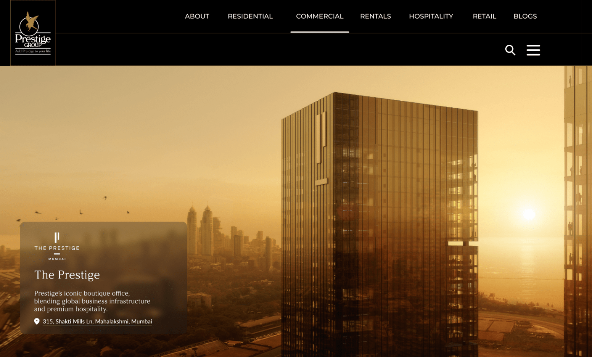
Redesigning for Modern Real Estate Luxury
Replacing corporate clutter with editorial clarity across 3 core pages for a modern luxury real estate platform.
The Brief — absolute property clarity. Prestige needed to completely redesign 3 core pages of their digital platform. The objective was to replace standard corporate clutter with complete presentation clarity, making massive property data, floor plans, and localized infrastructure instantly clear for high-intent buyers.
If you'd like to learn more, please get in touch.
The Wireframe
We initiated purely in grayscale to lock down structural hierarchy for interactive location maps, project filters, and property grids without visual distractions.
The Client Loop
We navigated 5 rounds of feedback with the Prestige team — five rounds of renegotiating how much technical property data versus lifestyle imagery the pages could hold. Each round, I had to defend or adjust the balance based on what the client actually needed from their buyers, and honestly, that meant putting aestheticism behind a lot of the time.
The Finalization: once mechanics were approved, we locked the direction and applied it across all 3 targeted pages, keeping the underlying system perfectly cohesive.
Technical Visual Architecture
Editorial Typography
We paired high-end serif titles for premium branding with clean, geometric sans-serif type for technical property specs and floor plan metrics.
Progressive Data Disclosure
Complex details are organized into clean, tabbed components. Users filter through Location, Master, and Floor Plans smoothly, while granular building specifications stay tucked cleanly below.
Geographic Clarity
The "Everything within Reach" module replaces generic map embeddings with a custom, stylized transit layout, mapping key proximity milestones with precise time-distance markers.
Takeaways: Build for Longevity
By translating the final approved pages into strict component-driven templates, we delivered a future-proof framework. The Prestige team can spin up new property phases, swap architectural layouts, and update amenities instantly without ever disrupting layout harmony.